Friday, 7 May 2010

Step by Step On My Front Cover

Step by Step for my Front Cover


Step 1- For my first step this is the main image for my front cover. This is the picture of JayJay Mraz. This has been edited by it being called "colour pop." This is where the saturation is put to -100 and then you rub the part of the picture you want in colour. Here i have colour popped the red guitar.
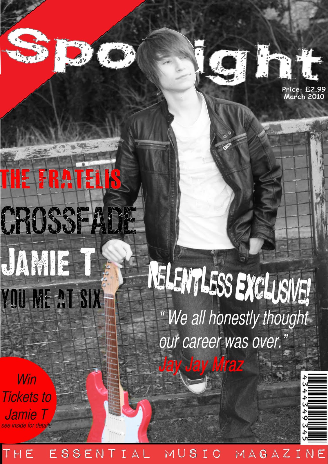
Step 2- For step two i have added the masthead of the magazine. This is one of the most important parts of the magazine the title of the brand of magazine otherwise if there is not a masthead, the public would not know what the magazine is called. Here i have put the masthead behind the head of the relentless band member JayJay Mraz. Also there is a red corner to my magazine which has been added to make a stylish front cover. This would be continued throughout the magazine.


Step 3- For step three i have added a tool bar at the bottom to make this look more stylish. The banner says "The Essential Music Magazine." Most magazines i have researched for my tasks, i have found out that they mainly do banners either at the top or bottom of the magazine, i feel this suits the bottom of the magazine more than the top of the magazine.

Step 4- For step four this is another main feature to the magazine and this is the writing of this. On the front cover it says a few different bands and these are "The Fratelis", "Crossfade", "You Me At Six", "Jamie T." Also another main feature included in this step in adding the speech text from JayJay Mraz and this is "I honestly though my career was over."


Step 5-For step five this is what is in every magazine and is very key for the company to have one. These are a Barcode which is needed for people to scan it to buy the magazine and also the date, and price is also another key factor which has been added. This is because the public would want to know what date the magazine has been issued because they want to read a magazine which is in a more recent day.


Step 6- For my final step the final step i did i have done a Pug this is in the corner of my magazine and this is a little advertisment sticker in my magazine.


Wednesday, 5 May 2010

Evaluation Question 7

what have you learnt in the progression from the preliminary task to the finished publication?
Looking back at the preliminary task which I did back at the beginning of the year, there is no comparison to the standard my work is at compared to the work I have just produced for my final products. However the preliminary tasks are done by straight forward conventions of a basic magazine, however this isn’t professional enough for a magazine. When I was making this preliminary task my Photoshop skills were at a very basic as I had never used Photoshop before. One of the problems I had were struggling with the magnetic lassoo tool as this is hard to concur as you have to keep a steady arm to do this. This took me a while to get used to also. The colours on the page a dull and boring and the page is set out in a very boring way. The sizes of text on the page vary while text along the front and contents pages. Showing both of my preliminary products you can clearly see that the professionalism of the two products is not there.
Looking at my three final products for my magazine you can see that I have learnt a lot more from Photoshop as I feel my products look a lot more better standard. To do this I had to expand and develop ideas I thought were ok to make sure they were at a professional standard. Through doing this piece of work i have learnt a lot of Photoshop and understood a lot of new skills on the software such as how to use the magnetic lasso tool much better than previous tasks and taking pictures which are of good quality and suitable for manipulation for my work. Also carrying out extensive research before carrying out my final product, this allowed me to rethink ideas to make these good and to make sure they look professional quality and learn from the lack of professionalism in my preliminary task. Comparing my preliminary and final product together, the final product is alot less spacey than my preliminary task, this gives it a look which looks professional. The colours used in my final production are more eye-catching and appealing to my target audience, between the making of my preliminary task and my final products, I have learnt that the colours I used in my preliminary were not as good and professional looking and they needed to be improved and they were In my final pieces and these colour I used were very professional.

Difference of Preliminary to Final Product


The Comparison/Difference between my preliminary and main final front cover are:
-My Final has a lot more headings of bands and headline stories.
-There is no barcode on my preliminary.
-On my final i have stuck to three colours of Red,White and Black, whereas there is black,white, red, purple.

-A comparison is there are pugs on both magazines.

-Both pictures have medium close ups and close ups.

-There is no price,date or website on my preliminary.


The Comparison/Difference of my Preliminary and my contents page:

-there are a lot more information writing on my final contents page.

-There are 3 pictures on my main contents page and 2 pictures on my preliminary.

-There are no pugs in my preliminary.

-House style not stuck to three colours on my preliminary.

-No date,time,website on the contents for my preliminary.


Evaluation Question 6


What have you learnt about technologies from the process of constructing this product?

Overall I have learnt well from a lot of technologies when making my final products. I used various different amounts of technologies and these are:

-Photoshop.

-Canon 500d Camera.

-Laptop/Mac computer.

-Blogger.

-Internet.

-Memory Sticks.

-Memory Cards.

I have learnt a lot about using Photoshop and I am now very confident in using it. Throughout constructing my final products I feel I had an advantage from others as I have used Photoshop a lot more on previous occasions for other coursework such as photography and ICT. I feel I have improved a lot more other the time of making my products as I know now how to work each button etc. At first I found the magnetic lassoo tool hard to use but in the end I found this easy to use as the practicing from doing it at school and at home helped. I also learnt well with the layers have images above and below certain layers this I feel was very key and hard at first and in the end I finished well. In my product on my front cover I had to cut out the persons head with the lasoo tool and layer it between the main image and the masthead this took a lot of time and care and overall I managed to do this well. Another Photoshop technique I found good was and which I did with all my main images in the end and this was colour pop. This is where you make the saturation to -100 and you then rub out the bit you want colour in or use the magnetic lassoo tool. The outcome is where all the picture is dark with a little hint of colour I feel this worked very well with my 3 pages for my media product.


For taking pictures, I found this was a easy and hard task to do. I found it easier because I already have a camera and it is a camera which photographers use around the world this is good because the resolution of the picture making it smaller and bigger is very good to use. I found it hard to find the right place to take pictures and I ended up having three different locations to take these pictures these were hard to sort the timing the place where the images was going to be taken, the background. These all had to be taken into case where they were going to go. In the end I feel that the place background and the image are very good and I am proud of the finishing product.


When doing my blog and finishing off my final products I used my laptop or the Mac computers at the school. On my laptop and the computers at school these had all the technologies needed for doing my blogger which was the internet and constructing and editing the final products on Photoshop. Having Photoshop on my laptop at home was a big boost because this meant that I could do this at home in my spare time.


For blogger I found this hard to use at first because I have never used this before but I have recently came to grips with it and I now find it easier to use. This was a key factor to my media work as this is where all of my coursework goes. Also this would allow customers to view the website www.rhys-whitehead.blogspot.com to see the questionnaires.


The internet was another technology which was important to my work. This is where the blogger was and if I didn’t have the internet this would mean that customers wouldn’t be allowed to see my blog and either will I. Also I used the internet to search for my research on the front covers, contents pages, and double page spreads on google, also to research the target audience, audience demographics and Maslows hierarchy theory all where searched on google. I also used www.dafont.com to find fonts to use for my media products.


Another important factor was my memory stick and memory card. Without these I wouldn’t be allowed to of transferred my work from my home work to my school work. These are very useful and it’s an easy way of transferring work. Also memory cards without these I would not be allowed to upload pictures on my computer to use for my magazine.


Evaluation Question 5

How did you attract/address your audience?tallk about questionnaires what you did to advertise it- post in on facebook


To attract my audience I had to make sure to follow the conventions which are to have the right layout, images, colour scheme house style appeal to the customers. I have to make sure that this is successful as this is proven to be a key factor for current top selling magazines. For my magazine I have to take into case the mise-en-scene is also another important factor in magazines is to attract my target audience. An example is on my double page spread, Jay Jay mraz there is a lot more colour in this picture to the other two pictures, as the red guitar and the blue shoes are coloured. This attracts my target audience because in my target audience Leon likes to wear leather jackets and likes to play the guitar. Also as well on my double page spread there is two smaller images where the text is there is two images which Leon would like as he likes cheque shirts and also leather jackets this would mean that my target audience would like this and this would attract him to get the magazine. From my poll 55% requested that they wanted a blue, red and white colour scheme. 22% chose red, black and white. I feel that I have done wrong here for my target audience because I haven’t listened to them and I should of done this. The reason I chose red, black and white is because the pictures I took was with a red guitar and I thought that for my editing of the pictures I was going to colour pop the picture and leave the red guitar in colour this would then look better with it being red, black and white because there would be a dark background representing well with the black. Other ways to grab the audiences attention i was offering a lot of chances to win tickets and competitions. On the front cover the was a pug which says "win tickets to Jamie" and on my contents page there was the chance to win tickets to new york. This would grab the audiences attention a lot as they will then want to buy the magazine to win chances of a life time courtesy of Spotlight magazine.


To advertise my media product I had to get feedback from customers to see what they want in a magazine, to do this I got fellow media students to do my questionnaire also to advertise my blog I posted the link on Facebook to get people around my age to do my questionnaire the results ended up well with quite a few people answering my questionnaire.


Evaluation Question 4

Who would be the audience for your media product?

The Audience for my media product will be from my research who was my target audience. This was who was described on my blog further back. My target audience's name was leon and he was what id like to call a stereotypical late teen boy. This is who likes fashionable clothes, loves parties etc. I feel i have represented my magazine well to target audience and i feel this is a key factor to represent to get a good amount of customers. This is because on my front cover and my double page i have listed bands which Leon(target audience).

Evaluation Question 3

What kind of media institution might distribute your media product and why?

For all of my media products i feel that this can be advertised in many ways. There are companies which own many media industry products. From research i have been doing for advertising i have found three media companies which do this and these are:


Ipc media is one of the biggest magazine manufacturers and it has up to 85 different magazines ranging from sport to house furniture to music magazines. It has famous brands such as NME, Nuts, Now, Guitar and Bass. This I feel is a good brand for my media product.


Warners group is also another big magazine manufacturer. They own 33 magazines but these are magazines which are irrelevant to my research. This is because they sell magazines such as Lakeland, taxi globe, magazines about trains. If i was to choose this manufacturer for my media product spotlight magazine I would not choose this because this is not a manufacturer which will be good as there are no music type genres which they promote.


Chp is the final media manufacturer I have researched and this is a much more smaller company this only has six magazines which they provide. I feel this is very bad because all of the magazines on the website are all cars such as 911 and porsche world, auto italia etc.


overall i would choose Ipc because i feel that this is a very good media company and this will sell alot more as it is well known more than the other media companies. Also i feel that they can then sell them to newsagents and super markets this is a place where most if not all customers buy there magazines. Also there is the option of subscription for 12 months for example and they would then save a lot more money.


Evaluation Question 2

How does your media product represent particular social groups?


I feel that my media product represents well to some particular groups. These I feel are for teenagers and early adults. This I feel is people of both genders ranged from the ages 15- 27 I feel the music genre I have done for the magazine represents a indie rock/light R&b. This is the type of music which teenagers and early adults like to listen to. Also I feel I will be grabbing their attention with the picture as this shows a fairly young man holding a guitar posing. My magazine is made to replicate my target audience of a teen who is studying in university and enjoys partying. To make this appeal to my target audience i had to choose colour schemes, artists, locations where to take pictures. This all had to been taken into case for my final ideas to match my social group. Also I have included bands in which was from a genre people wanted in my magazine from my questionnaire.


This is the main image from my contents page. When you want to choose a social group i have picked the group based on my genre of music and the target audience. In this picture i feel this represents a rocker/indie group. This is because to base it on a rocker there is a guitar in the picture. Also to represent the rocker theme the main protagonist of the picture and magazine is wearing a leather jacket which i feel represents well with the rocker theme. also long hair is another attribute to add to the rocker theme. To show this rocker theme i have based pictures like this around my front cover, double page spread and contents page to relate a lot to the rock/indie theme

Evaluation Question 1


In What ways does your media product use,develop or challenge forms and conventions of real media products?
my final products I did for my magazines, I used most of the same conventions of what you use in a magazine. The following things i have done are as follows:

The Bar code- this is because every magazine you see have a bar code. Its important because when you buy the product you scan it the price comes up on the cashier. For my magazine to look as professional as it can be i would need a bar code and i have that on my front cover magazine.

The issue Number- This is also another key part to the magazine as customers who are buying this need to know what date it is the magazine they are buying. In music magazines they all have the date and issue number on the magazine to show customers that how close the date is to the date it is. Customers want a magazine which is up to date and if there isn't a date customers may not buy the magazine.

Main image-for main images this is perhaps the main part to a magazine. This is because its important to show an image which strikes a strong factor for which customers would be attracted to. Its important for a strong image on the front cover to catch a customers eye. I feel my image a strong image for a front cover as i feel it sticks out with the red guitar in the picture.

Pugs- Pugs are very important factor to show the conventions for real life media products because these show little advertisements around the magazine. In my magazine i have included a pug which says "Win tickets to Jamie T" in real life magazines they say similar writing to what mine says and they also say " which is shown in my other magazine I have show in this post which is "CDs are dead- The 30 hottest spots for hip hop and R& B."

Colour scheme- The colour scheme is also vital to the magazine to keep the house style the same throughout the magazine. This is important as this will keep the magazine looking professional and this is important. Through my analysis I have found out that magazines such as NME and Kerrang and Q magazines they all keep the same colour scheme throughout the magazine and this is mainly Red, Black and White. This is the same colour scheme of what i have done throughout my magazine.

Bold fonts- This is similar to colour scheme and this is keeping the same fonts throughout the magazine. Through my analysis of real life magazines i realised that all magazine tend to keep the same fonts throughout the whole magazine. In my magazine i haven't done this in my magazine. The reason this is because i wanted to change my fonts for the speech on my front cover compared to my double page spread writing.

Pictures-This is also another important factor to see how many pictures you have on each page. On magazines i have analysed i have found out that in magazines they have more than one photo in on each page. This is different to what i have done this is because I have done one picture on each page i have done. I feel this doesn't matter how many pictures you have on the cover. I feel i have covered the space well by putting a lot more text there.