


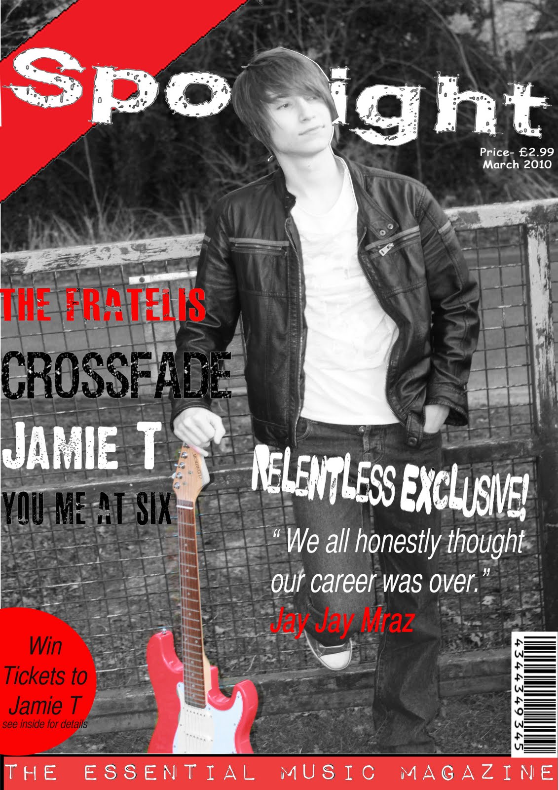
 Step 2- For step two i have added the masthead of the magazine. This is one of the most important parts of the magazine the title of the brand of magazine otherwise if there is not a masthead, the public would not know what the magazine is called. Here i have put the masthead behind the head of the relentless band member JayJay Mraz. Also there is a red corner to my magazine which has been added to make a stylish front cover. This would be continued throughout the magazine.
  Step 3- For step three i have added a tool bar at the bottom to make this look more stylish. The banner says "The Essential Music Magazine." Most magazines i have researched for my tasks, i have found out that they mainly do banners either at the top or bottom of the magazine, i feel this suits the bottom of the magazine more than the top of the magazine.
 Step 4- For step four this is another main feature to the magazine and this is the writing of this. On the front cover it says a few different bands and these are "The Fratelis", "Crossfade", "You Me At Six", "Jamie T." Also another main feature included in this step in adding the speech text from JayJay Mraz and this is "I honestly though my career was over."
Step 5-For step five this is what is in every magazine and is very key for the company to have one. These are a Barcode which is needed for people to scan it to buy the magazine and also the date, and price is also another key factor which has been added. This is because the public would want to know what date the magazine has been issued because they want to read a magazine which is in a more recent day.
 Step 6- For my final step the final step i did i have done a Pug this is in the corner of my magazine and this is a little advertisment sticker in my magazine.
 Looking back at the preliminary task which I did back at the beginning of the year, there is no comparison to the standard my work is at compared to the work I have just produced for my final products. However the preliminary tasks are done by straight forward conventions of a basic magazine, however this isn’t professional enough for a magazine. When I was making this preliminary task my Photoshop skills were at a very basic as I had never used Photoshop before. One of the problems I had were struggling with the magnetic lassoo tool as this is hard to concur as you have to keep a steady arm to do this. This took me a while to get used to also. The colours on the page a dull and boring and the page is set out in a very boring way. The sizes of text on the page vary while text along the front and contents pages. Showing both of my preliminary products you can clearly see that the professionalism of the two products is not there.
Difference of Preliminary to Final Product


The Comparison/Difference of my Preliminary and my contents page:
-there are a lot more information writing on my final contents page.
-There are 3 pictures on my main contents page and 2 pictures on my preliminary.
-There are no pugs in my preliminary.
-House style not stuck to three colours on my preliminary.
-No date,time,website on the contents for my preliminary.
Overall I have learnt well from a lot of technologies when making my final products. I used various different amounts of technologies and these are:
-Photoshop.
-Canon 500d Camera.
-Laptop/Mac computer.
-Blogger.
-Internet.
-Memory Sticks.
-Memory Cards.
I have learnt a lot about using Photoshop and I am now very confident in using it. Throughout constructing my final products I feel I had an advantage from others as I have used Photoshop a lot more on previous occasions for other coursework such as photography and ICT. I feel I have improved a lot more other the time of making my products as I know now how to work each button etc. At first I found the magnetic lassoo tool hard to use but in the end I found this easy to use as the practicing from doing it at school and at home helped. I also learnt well with the layers have images above and below certain layers this I feel was very key and hard at first and in the end I finished well. In my product on my front cover I had to cut out the persons head with the lasoo tool and layer it between the main image and the masthead this took a lot of time and care and overall I managed to do this well. Another Photoshop technique I found good was and which I did with all my main images in the end and this was colour pop. This is where you make the saturation to -100 and you then rub out the bit you want colour in or use the magnetic lassoo tool. The outcome is where all the picture is dark with a little hint of colour I feel this worked very well with my 3 pages for my media product.

For taking pictures, I found this was a easy and hard task to do. I found it easier because I already have a camera and it is a camera which photographers use around the world this is good because the resolution of the picture making it smaller and bigger is very good to use. I found it hard to find the right place to take pictures and I ended up having three different locations to take these pictures these were hard to sort the timing the place where the images was going to be taken, the background. These all had to be taken into case where they were going to go. In the end I feel that the place background and the image are very good and I am proud of the finishing product.

When doing my blog and finishing off my final products I used my laptop or the Mac computers at the school. On my laptop and the computers at school these had all the technologies needed for doing my blogger which was the internet and constructing and editing the final products on Photoshop. Having Photoshop on my laptop at home was a big boost because this meant that I could do this at home in my spare time.

For blogger I found this hard to use at first because I have never used this before but I have recently came to grips with it and I now find it easier to use. This was a key factor to my media work as this is where all of my coursework goes. Also this would allow customers to view the website www.rhys-whitehead.blogspot.com to see the questionnaires.

The internet was another technology which was important to my work. This is where the blogger was and if I didn’t have the internet this would mean that customers wouldn’t be allowed to see my blog and either will I. Also I used the internet to search for my research on the front covers, contents pages, and double page spreads on google, also to research the target audience, audience demographics and Maslows hierarchy theory all where searched on google. I also used www.dafont.com to find fonts to use for my media products.

Another important factor was my memory stick and memory card. Without these I wouldn’t be allowed to of transferred my work from my home work to my school work. These are very useful and it’s an easy way of transferring work. Also memory cards without these I would not be allowed to upload pictures on my computer to use for my magazine.


To attract my audience I had to make sure to follow the conventions which are to have the right layout, images, colour scheme house style appeal to the customers. I have to make sure that this is successful as this is proven to be a key factor for current top selling magazines. For my magazine I have to take into case the mise-en-scene is also another important factor in magazines is to attract my target audience. An example is on my double page spread, Jay Jay mraz there is a lot more colour in this picture to the other two pictures, as the red guitar and the blue shoes are coloured. This attracts my target audience because in my target audience Leon likes to wear leather jackets and likes to play the guitar. Also as well on my double page spread there is two smaller images where the text is there is two images which Leon would like as he likes cheque shirts and also leather jackets this would mean that my target audience would like this and this would attract him to get the magazine. From my poll 55% requested that they wanted a blue, red and white colour scheme. 22% chose red, black and white. I feel that I have done wrong here for my target audience because I haven’t listened to them and I should of done this. The reason I chose red, black and white is because the pictures I took was with a red guitar and I thought that for my editing of the pictures I was going to colour pop the picture and leave the red guitar in colour this would then look better with it being red, black and white because there would be a dark background representing well with the black. Other ways to grab the audiences attention i was offering a lot of chances to win tickets and competitions. On the front cover the was a pug which says "win tickets to Jamie" and on my contents page there was the chance to win tickets to new york. This would grab the audiences attention a lot as they will then want to buy the magazine to win chances of a life time courtesy of Spotlight magazine.

To advertise my media product I had to get feedback from customers to see what they want in a magazine, to do this I got fellow media students to do my questionnaire also to advertise my blog I posted the link on Facebook to get people around my age to do my questionnaire the results ended up well with quite a few people answering my questionnaire.
 (target audience).


 Picture 1


Apple Chancery- i like this font because it looks very old but very stylish.
Arial- This is a very simple font but i think this is a easy font which will be able to read as i feel this looks very clear/
Helvetica- This is very similar to Arial and i feel this is the same where as it looks very simple but effective by it being easier to read.
Stone Sans ICT TT-Semi- For this font this is similar to times new roman font but i feel this looks good, with it being very simple but very effective and professional looking if i was to choose it.
Ayuthaya- This is a very nice font as it looks rounded. But the problem for this font is that it is to spaced out.
Chalkboard-This is also another font I like as this looks rounded edges and I like the style used her. This could be a possible decision for my final idea.

 For my third and final contents page I am going to analyze a kerrang magazine contents page. Kerrang magazine is a very popular rock magazine in the UK. In this contents which im going to analyze there is a lot of information n this contents compared to what there is from the other two contents pages. There are a lot of pictures on the page also there is writing with it saying all what is inside the page.


